


My Role: As a UX/UI Designer at VML I worked with a large team of developers, copywriters, consulting analysts, project managers and designers in a fast paced Agile environment where we constantly iterate and test solutions while working closely with our client. Our goal is to not only reduce call drivers but make a cohesive user-centric experience across desktop and mobile platforms.
The Project
Change Plan

Goals/Objectives
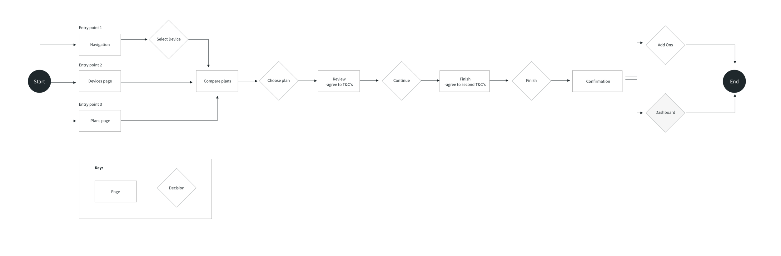
Make the change plan process for customers clear, quick, and painless in order for our customer service call volume to decrease.
Background
Sprint customer service received large call volume for customers who needed to change their plans. Our goal was to create a quick and painless experience for customers to change their plan themselves without the help of customer service.
User Flow
I strived to keep as few steps involved in the change plan flow. This was a long back and forth process with stakeholders to whittle away some unnecessary business requirements. One example of this was they wanted add-ons to be apart of the change plan process. We compromised and left it as a next-step option for the users after successfully changing plans.
Final Prototype
Takeaways
I believe Product Designers are advocates for users. This was a project in which we really had to push back on business requirements and ask “why” in order to make this change plan flow as simple as possible for the user. Once, we could develop a prototype and show stakeholders just how simple it could be they understood why we were pushing back and were happy with the outcome. In the end, this change plan experience reduced call drivers which was the main goal.
The Project
Profile

Goals/Objectives
Help users create an account for Sprint.com. We want the lowest barrier of entry possible so users won’t drop off in midst of creating an account. Once, they create an account they will be able to manage their bills, plans and profile etc.
Background
The old experience of creating an account was clunky and users would drop off halfway through because it was too long of a process.
User Flow

Wireframes

Annotations
1. Auto-focus the first input field in the form. Autofocusing guides users to the starting point of your form.
2. Format Your Fields with Input Masks. To fix input problems use input masks on formatted data fields.
3. Make the button disabled until all the required inputs are completed. This is another way to visually validate inputs before submission.
4. Let users see their passwords. It helps users to check their passwords before submission.
5. Show the password requirements before submission. If your service needs specific requirements for passwords, show them before submitting the form.
6. Name buttons properly. Instead of using a general Submit label, a form button should describe exactly what the user is doing in their task — Create Account, Log In etc.
Additionally: Highlight error fields with color, icons and text. Make the error message clearly visible, use different ways to emphasize it — color, text and icon.
Compromises
We tried to push for only one Terms and Conditions checkbox at the end but ultimately Sprint’s legal team would not allow for it.
Final Prototype
Takeaways
Designing a sign up user flow seems simple but there are many intricate requirements/interactions to think through. Noted above in the annotations of the wireframes. Call drivers were reduced and the sign up flow is now a lot more simple for users. This was a great project to be apart of.